

SHAPE STUDIES#1
July 12, 2026
หนังสือสอนถ่ายภาพเล่มหนึ่งมีความน่าสนใจมาก หนังสือเล่มนั้นชื่อ ‘Useful Advice for Photographers’ (ข้อแนะนำที่เป็นประโยชน์สำหรับช่างภาพ) เขียนโดย ไอวาร์ส กราฟเลจ (Ivars Gravlejs, b. 1979) ศิลปินชาวลัทเวีย เป็นหนังสือที่มีภาพถ่ายสองภาพวางเปรียบเทียบกัน โดยใต้ภาพจะมีคำแนะนำการถ่ายภาพสั้น ๆ ภาพด้านซ้ายจะเขียนว่า Wrong (ผิด) และด้านขวาเขียนว่า Right (ถูก) หมายความตามปกติคือ อย่าไปถ่ายตามภาพที่เขียนว่า Wrong แต่ถ่ายตามภาพที่เขียนว่า Right ซึ่งเป็นวิธีสอนที่ตรงไปตรงมาเหมือนกับหนังสือหรือตามเวิร์คช็อปสอนถ่ายภาพทั่วไป
ถ้าดูผ่าน ๆ และไม่ได้สังเกตนักก็คงเข้าใจไปเลยว่าให้ทำตามแบบนั้น เช่น หากถ่ายภาพคนที่มีชื่อเสียง ให้ถ่ายภาพของเขาให้ดูน่าเคารพนับถือ (Prominent personalities try to photograph in the way that look respectable) ซึ่งในภาพประกอบคือ ผู้ที่มีชื่อเสียงคนหนึ่งถูกถ่ายภาพตอนกำลังหลับตาในภาพที่เขียนว่า Wrong และภาพที่เธอลืมตาในภาพที่เขียนว่า Right หรืออีกตัวอย่างหนึ่งเขียนว่า เมื่อใดที่ถ่ายภาพอย่าลืมเช็คเรื่อง White Balance (When you photograph don't forget about white balance) ซึ่งเป็นภาพของหอคอยหนึ่งที่สีเพี้ยน (Wrong) และสีถูกต้อง (Right) ในอีกภาพหนึ่ง
แต่หากสังเกตให้ดี ภาพที่เขียนว่า Right กลับกลายเป็นภาพที่น่าเบื่อ เหมาะกับการประกอบบทความทั่วไป แต่ภาพที่เขียนว่า Wrong กลับดูน่าสนใจอย่างประหลาด แล้วถ้าเลยไปดูอีกว่า ไอวาร์ส กราฟเลจ เป็นใครและทำงานศิลปะแบบไหน ก็คงจะเดาได้ไม่ยากว่าหนังสือสอนถ่ายภาพเล่มนี้ทำออกมาเพื่อที่จะบอกว่า ความจริง ความงาม มันมีรูปแบบหนึ่งเดียวและจีรังยั่งยืนซะที่ไหน สิ่งเหล่านี้มันเป็นเรื่องของอัตวิสัยที่เปลี่ยนไปเปลี่ยนมา (แม้ในคนเดียวกันก็ตาม) พวกมันล่มสลาย และก่อรูปขึ้นใหม่ได้ตลอดเวลา
งานภาพถ่ายอีกชิ้นหนึ่งที่มีแนวคิดใกล้เคียงกัน หากถูกสร้างมาก่อนหน้านี้จากศิลปินแนวคิด (Conceptual Artist) ชาวอเมริกันที่ชื่อ จอห์น บัลเดสซารี (John Baldessari, 1931–2020) งานชิ้นนี้มีชื่อว่า Wrong (1967) บัลเดสซารีสร้างงานชิ้นนี้ขึ้นมาหลังจากได้อ่านหนังสือสอนศิลปะเล่มหนึ่งที่มีภาพทิวทัศน์สองภาพ โดยที่ผู้เขียนหนังสือเล่มนั้นได้ตัดสินว่าภาพใด Right และอีกภาพคือ Wrong อย่างโจ่งแจ้ง บัลเดสซารีสนใจแนวคิดเช่นนี้มาก เพราะทำให้เขาได้รู้ว่า ความถูกหรือผิด มักถูกตัดสินอย่างง่าย ๆ โดยผู้ที่มีอำนาจบางอย่างที่เหนือกว่า
บัลเดสซารีทำให้ Wrong มีความเรียบเฉยไร้อารมณ์ (Deadpan) เพื่อตอบโต้ความงามตามกฎเกณฑ์ของสถาบันศิลปะกลาย ๆ เขาส่งสารอันยอกย้อนเสียดสีไปหาเหล่าบรรดาผู้ที่ชอบผูกขาดคำว่า Wrong อย่างเงียบเชียบ ภาพถ่ายขาวดำดาด ๆ ภาพหนึ่งและคำว่า Wrong ใต้ภาพ ทำงานของมันอย่างดีกับคนที่คิดว่ามัน Wrong จริง ๆ และคนที่คิดตรงข้าม
ทั้งหนังสือสอนถ่ายภาพของ ไอวาร์ส กราฟเลจ และ Wrong ของ จอห์น บัลเดสซารี เป็นตัวแทนที่บอกเราว่า เรื่องใด ๆ มักจะมีมุมมองที่หลากหลายโดยตัวมันเอง มันเป็นสาระสำคัญเดียวกันกับธรรมชาติของภาพถ่าย สิ่งที่อาศัยอยู่ภายในกรอบสี่เหลี่ยมล้วนถูกคัดกรองจากศิลปิน โดยผู้ทรงภูมิปัญญาทางศิลปะและน่าเชื่อถือ พวกเขารวมหัวกันจัดแจง ตัดแต่ง จนออกมาเป็นโลกทัศน์หนึ่งซึ่งพวกเราเอามาใช้ตีความธรรมชาติของเรื่องราวเหล่านั้นอย่างง่าย ๆ และทิ้งโลกทัศน์อื่นของธรรมชาติไปง่าย ๆ เช่นเดียวกัน
งานภาพถ่ายเชิงความคิดอีกงานที่พูดถึงเรื่องโลกทัศน์อื่น ๆ ในเหตุการณ์เดียวกันได้อย่างเรียบง่ายและตรงประเด็นคืองานที่ชื่อ Cause of Death? (1974) ของ จอห์น ฮิลเลียร์ด (John Hilliard, b. 1945) ศิลปินแนวคิดชาวอังกฤษ งานนี้แสดงภาพที่ตัดขอบ (Cropped Phototgraph) สี่ภาพของคนตายคนหนึ่งที่ถูกคลุมผ้าอยู่ในมุมมองที่ต่างกัน แล้วใช้คำหนึ่งคำบรรยายภาพที่ตัดขอบเหล่านั้น ภาพแรกคือ ภาพของผู้ตายและกองเศษหินที่อยู่ใกล้เคียง ราวกับว่าเขาถูกหินถล่มลงมาทับตาย ภาพนี้บรรยายด้วยคำว่า CRUSHED ภาพต่อมาตัดขอบให้เห็นแหล่งน้ำที่อยู่ใกล้ ๆ เขียนบรรยายว่า DROWNED อีกภาพ ฮิลเลียร์ดตัดขอบภาพให้ผู้ตายนอนอยู่ใกล้กองไฟ ประกอบกับคำว่า BURNED ภาพสุดท้ายคือภาพที่ด้านหลังไกล ๆ ของผู้ตายคือสิ่งก่อสร้างขนาดสูง และบรรยายด้วยคำว่า FELL
ภาพทั้ง 4 ภาพคือภาพเดียวกัน เพียงแค่ว่าศิลปินตัดขอบภาพให้ต่างกันออกไป และบรรยายด้วยคำพูดที่ชี้นำให้เห็นถึงความเป็นไปได้ทั้งหลายที่อาจเป็นเหตุของการตาย งานชิ้นนี้เป็นตัวอย่างชั้นดีที่สะท้อนถึงเรื่องราวมากมายที่ผูกติดอยู่กับความเป็นภาพถ่าย ภาพถ่ายที่ดูเหมือนว่าจะเป็นตัวแทนของมนุษย์ที่เข้าใกล้ความจริงมากที่สุดสื่อหนึ่ง แต่ก็อาจถูกใช้เป็นเครื่องมือของผู้มีอำนาจในการควบคุมความคิด และโลกทัศน์ของผู้ที่ไม่ได้คิดเฉลียวใจกับเนื้อความที่แสดงอยู่ หรือที่ถูกตัดทิ้งไป
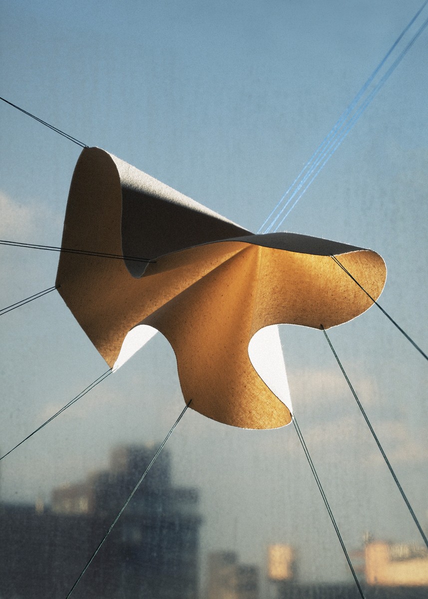
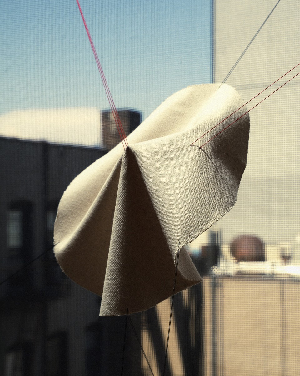
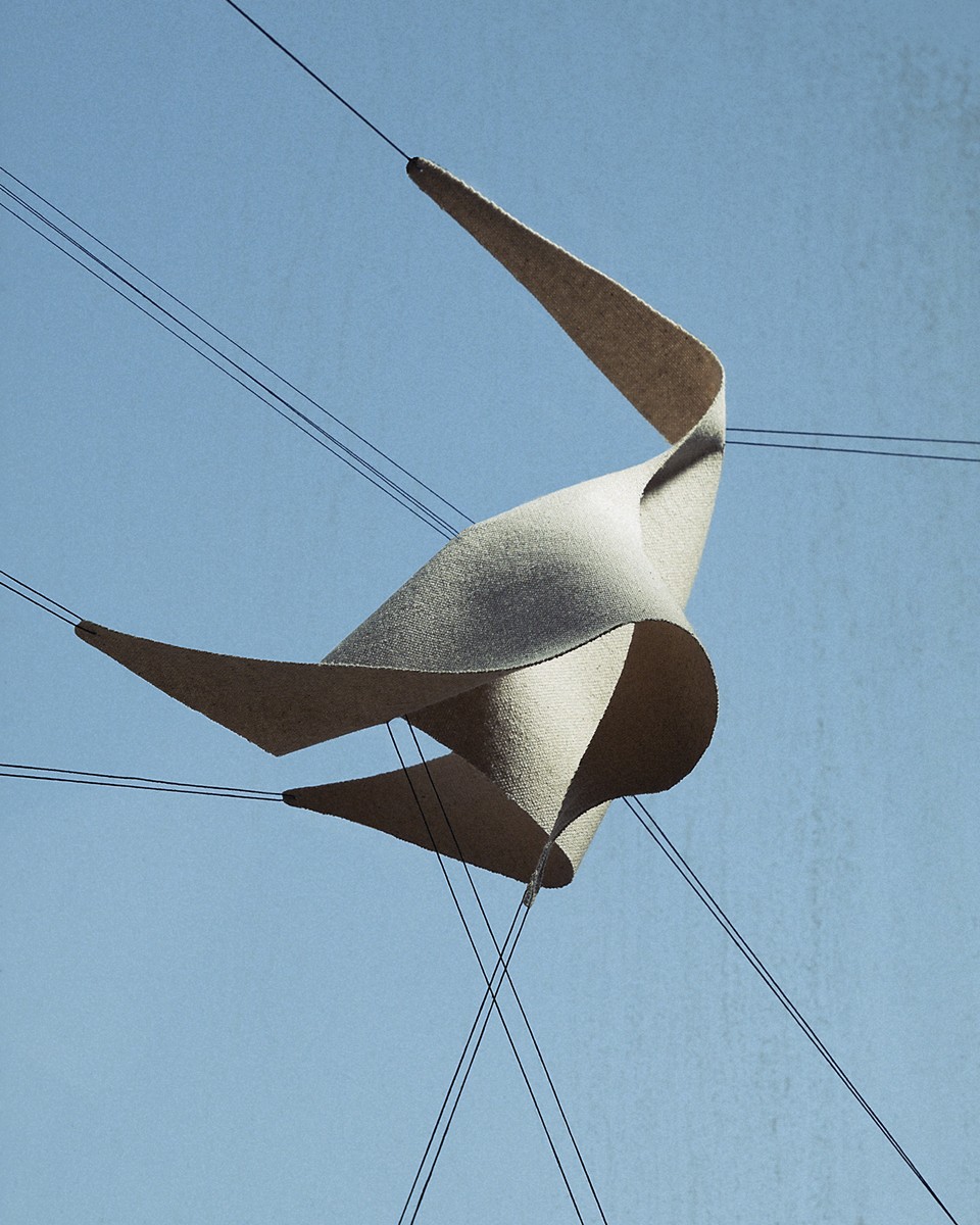
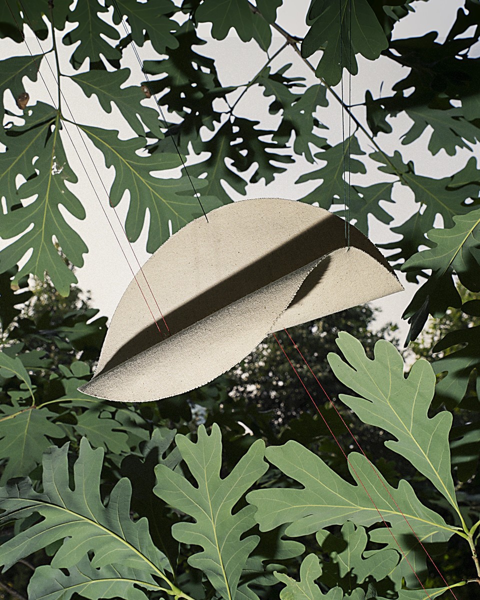
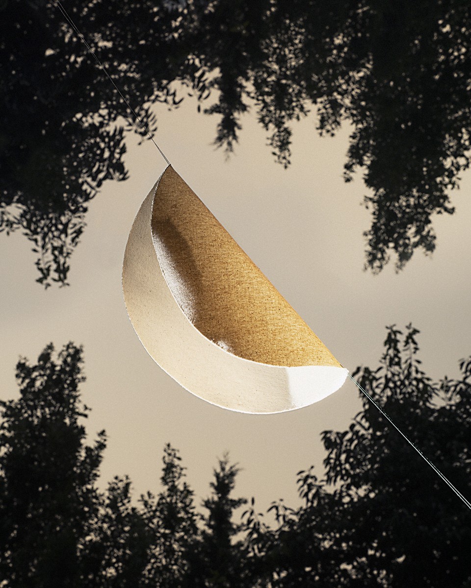
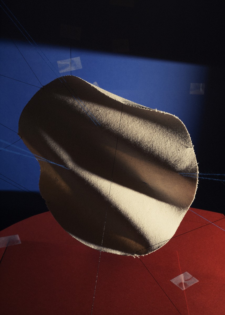
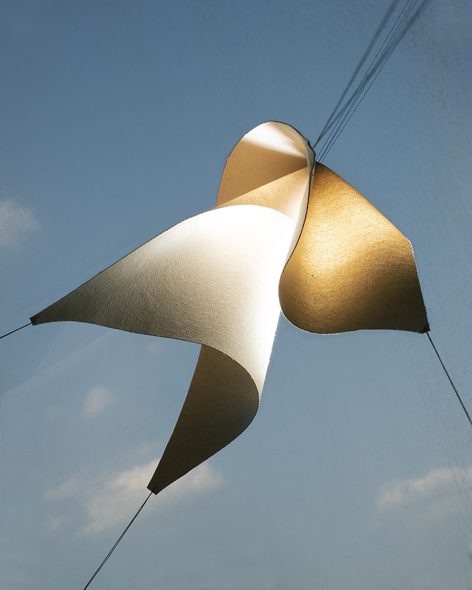
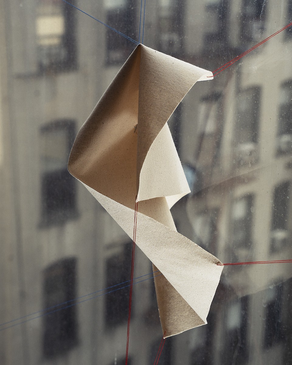
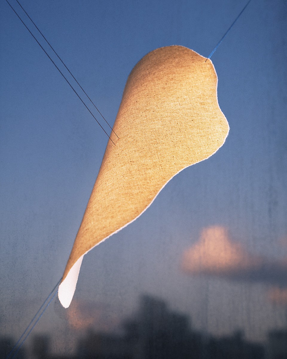
งานชิ้นที่ชื่อว่า SHAPE STUDIES#1 ของ ภูมิภัทร อุษาประทุมบาน (Pumipat Usapratumban) ศิลปินภาพถ่ายชาวไทย กำลังบอกเรื่องโลกทัศน์ของสิ่ง ๆ หนึ่งที่คนทั่วไปรับรู้ว่ามันมีนิยามและรูปลักษณ์อย่างไร หากแท้ที่จริงมันสามารถปรับเปลี่ยนไปได้เมื่อพยายามมองมันในมุมที่ต่างออกไป ผืนผ้าฝ้ายถูกนำมาตัดเป็นผืนเล็ก ๆ แล้วจับมาขึงด้วยเชือกจนทำให้รูปทรงเปลี่ยนไป จากที่เป็นเพียงผืนผ้าสองมิติ เมื่อถูกจัดวางและปรับมุมมอง มิติใหม่ ๆ ของวัตถุจึงเกิดขึ้นมาได้อย่างน่าสนใจ ประกอบกับสิ่งที่ปรากฏอยู่เป็นพื้นหลัง มันทำให้สิ่งไร้ชีวิตแสนธรรมดาดูคล้ายสิ่งมีชีวิตบางอย่างที่บิดตัวไปมากลางอากาศอย่างน่าประหลาด—พวกมันสวยงามผสมพิศดารในเวลาเดียวกัน
ภูมิภัทรกล่าวว่า “สิ่งที่ทำให้ฉันรู้สึกทึ่งก็คือ การที่ภาพถ่ายสามารถเปลี่ยนวิธีที่เรามองเห็นและรับรู้วัตถุชิ้นหนึ่งไปได้อย่างไร รวมถึงการที่ตัวตนบางอย่างของวัตถุนั้นเด่นชัดขึ้นมา ในขณะที่คุณสมบัติอื่น ๆ กลับเลือนหายไป ภาพถ่ายเหล่านี้จึงไม่ได้ทำหน้าที่เป็นเพียงแค่การบันทึกตัววัตถุเอาไว้เท่านั้น แต่กำลังนำเสนอทางเลือกและวิธีคิดใหม่ ๆ ในการมองเห็นวัตถุชิ้นนั้นแทน”
SHAPE STUDIES#1 อาจเป็นตัวแทนของมุมมองที่เปลี่ยนไปมาได้ของศิลปินและผู้ชม ความจริงมันไม่เคยมีเพียงด้านเดียวหรือมิติเดียว คำว่า Wrong—Right ปะปนผสมกันไปบนผืนผ้าฝ้าย ที่ราวกับกำลังโชว์เนื้อหนังมังสาแห่งความจริง พวกมันดีดดิ้นตัวไปมาบนความคิดของมนุษย์ที่แสนจะหยิ่งทะนง และดูน่าขันยิ่งนัก
ถ้าดูผ่าน ๆ และไม่ได้สังเกตนักก็คงเข้าใจไปเลยว่าให้ทำตามแบบนั้น เช่น หากถ่ายภาพคนที่มีชื่อเสียง ให้ถ่ายภาพของเขาให้ดูน่าเคารพนับถือ (Prominent personalities try to photograph in the way that look respectable) ซึ่งในภาพประกอบคือ ผู้ที่มีชื่อเสียงคนหนึ่งถูกถ่ายภาพตอนกำลังหลับตาในภาพที่เขียนว่า Wrong และภาพที่เธอลืมตาในภาพที่เขียนว่า Right หรืออีกตัวอย่างหนึ่งเขียนว่า เมื่อใดที่ถ่ายภาพอย่าลืมเช็คเรื่อง White Balance (When you photograph don't forget about white balance) ซึ่งเป็นภาพของหอคอยหนึ่งที่สีเพี้ยน (Wrong) และสีถูกต้อง (Right) ในอีกภาพหนึ่ง
แต่หากสังเกตให้ดี ภาพที่เขียนว่า Right กลับกลายเป็นภาพที่น่าเบื่อ เหมาะกับการประกอบบทความทั่วไป แต่ภาพที่เขียนว่า Wrong กลับดูน่าสนใจอย่างประหลาด แล้วถ้าเลยไปดูอีกว่า ไอวาร์ส กราฟเลจ เป็นใครและทำงานศิลปะแบบไหน ก็คงจะเดาได้ไม่ยากว่าหนังสือสอนถ่ายภาพเล่มนี้ทำออกมาเพื่อที่จะบอกว่า ความจริง ความงาม มันมีรูปแบบหนึ่งเดียวและจีรังยั่งยืนซะที่ไหน สิ่งเหล่านี้มันเป็นเรื่องของอัตวิสัยที่เปลี่ยนไปเปลี่ยนมา (แม้ในคนเดียวกันก็ตาม) พวกมันล่มสลาย และก่อรูปขึ้นใหม่ได้ตลอดเวลา
งานภาพถ่ายอีกชิ้นหนึ่งที่มีแนวคิดใกล้เคียงกัน หากถูกสร้างมาก่อนหน้านี้จากศิลปินแนวคิด (Conceptual Artist) ชาวอเมริกันที่ชื่อ จอห์น บัลเดสซารี (John Baldessari, 1931–2020) งานชิ้นนี้มีชื่อว่า Wrong (1967) บัลเดสซารีสร้างงานชิ้นนี้ขึ้นมาหลังจากได้อ่านหนังสือสอนศิลปะเล่มหนึ่งที่มีภาพทิวทัศน์สองภาพ โดยที่ผู้เขียนหนังสือเล่มนั้นได้ตัดสินว่าภาพใด Right และอีกภาพคือ Wrong อย่างโจ่งแจ้ง บัลเดสซารีสนใจแนวคิดเช่นนี้มาก เพราะทำให้เขาได้รู้ว่า ความถูกหรือผิด มักถูกตัดสินอย่างง่าย ๆ โดยผู้ที่มีอำนาจบางอย่างที่เหนือกว่า
บัลเดสซารีทำให้ Wrong มีความเรียบเฉยไร้อารมณ์ (Deadpan) เพื่อตอบโต้ความงามตามกฎเกณฑ์ของสถาบันศิลปะกลาย ๆ เขาส่งสารอันยอกย้อนเสียดสีไปหาเหล่าบรรดาผู้ที่ชอบผูกขาดคำว่า Wrong อย่างเงียบเชียบ ภาพถ่ายขาวดำดาด ๆ ภาพหนึ่งและคำว่า Wrong ใต้ภาพ ทำงานของมันอย่างดีกับคนที่คิดว่ามัน Wrong จริง ๆ และคนที่คิดตรงข้าม
ทั้งหนังสือสอนถ่ายภาพของ ไอวาร์ส กราฟเลจ และ Wrong ของ จอห์น บัลเดสซารี เป็นตัวแทนที่บอกเราว่า เรื่องใด ๆ มักจะมีมุมมองที่หลากหลายโดยตัวมันเอง มันเป็นสาระสำคัญเดียวกันกับธรรมชาติของภาพถ่าย สิ่งที่อาศัยอยู่ภายในกรอบสี่เหลี่ยมล้วนถูกคัดกรองจากศิลปิน โดยผู้ทรงภูมิปัญญาทางศิลปะและน่าเชื่อถือ พวกเขารวมหัวกันจัดแจง ตัดแต่ง จนออกมาเป็นโลกทัศน์หนึ่งซึ่งพวกเราเอามาใช้ตีความธรรมชาติของเรื่องราวเหล่านั้นอย่างง่าย ๆ และทิ้งโลกทัศน์อื่นของธรรมชาติไปง่าย ๆ เช่นเดียวกัน
งานภาพถ่ายเชิงความคิดอีกงานที่พูดถึงเรื่องโลกทัศน์อื่น ๆ ในเหตุการณ์เดียวกันได้อย่างเรียบง่ายและตรงประเด็นคืองานที่ชื่อ Cause of Death? (1974) ของ จอห์น ฮิลเลียร์ด (John Hilliard, b. 1945) ศิลปินแนวคิดชาวอังกฤษ งานนี้แสดงภาพที่ตัดขอบ (Cropped Phototgraph) สี่ภาพของคนตายคนหนึ่งที่ถูกคลุมผ้าอยู่ในมุมมองที่ต่างกัน แล้วใช้คำหนึ่งคำบรรยายภาพที่ตัดขอบเหล่านั้น ภาพแรกคือ ภาพของผู้ตายและกองเศษหินที่อยู่ใกล้เคียง ราวกับว่าเขาถูกหินถล่มลงมาทับตาย ภาพนี้บรรยายด้วยคำว่า CRUSHED ภาพต่อมาตัดขอบให้เห็นแหล่งน้ำที่อยู่ใกล้ ๆ เขียนบรรยายว่า DROWNED อีกภาพ ฮิลเลียร์ดตัดขอบภาพให้ผู้ตายนอนอยู่ใกล้กองไฟ ประกอบกับคำว่า BURNED ภาพสุดท้ายคือภาพที่ด้านหลังไกล ๆ ของผู้ตายคือสิ่งก่อสร้างขนาดสูง และบรรยายด้วยคำว่า FELL
ภาพทั้ง 4 ภาพคือภาพเดียวกัน เพียงแค่ว่าศิลปินตัดขอบภาพให้ต่างกันออกไป และบรรยายด้วยคำพูดที่ชี้นำให้เห็นถึงความเป็นไปได้ทั้งหลายที่อาจเป็นเหตุของการตาย งานชิ้นนี้เป็นตัวอย่างชั้นดีที่สะท้อนถึงเรื่องราวมากมายที่ผูกติดอยู่กับความเป็นภาพถ่าย ภาพถ่ายที่ดูเหมือนว่าจะเป็นตัวแทนของมนุษย์ที่เข้าใกล้ความจริงมากที่สุดสื่อหนึ่ง แต่ก็อาจถูกใช้เป็นเครื่องมือของผู้มีอำนาจในการควบคุมความคิด และโลกทัศน์ของผู้ที่ไม่ได้คิดเฉลียวใจกับเนื้อความที่แสดงอยู่ หรือที่ถูกตัดทิ้งไป
งานชิ้นที่ชื่อว่า SHAPE STUDIES#1 ของ ภูมิภัทร อุษาประทุมบาน (Pumipat Usapratumban) ศิลปินภาพถ่ายชาวไทย กำลังบอกเรื่องโลกทัศน์ของสิ่ง ๆ หนึ่งที่คนทั่วไปรับรู้ว่ามันมีนิยามและรูปลักษณ์อย่างไร หากแท้ที่จริงมันสามารถปรับเปลี่ยนไปได้เมื่อพยายามมองมันในมุมที่ต่างออกไป ผืนผ้าฝ้ายถูกนำมาตัดเป็นผืนเล็ก ๆ แล้วจับมาขึงด้วยเชือกจนทำให้รูปทรงเปลี่ยนไป จากที่เป็นเพียงผืนผ้าสองมิติ เมื่อถูกจัดวางและปรับมุมมอง มิติใหม่ ๆ ของวัตถุจึงเกิดขึ้นมาได้อย่างน่าสนใจ ประกอบกับสิ่งที่ปรากฏอยู่เป็นพื้นหลัง มันทำให้สิ่งไร้ชีวิตแสนธรรมดาดูคล้ายสิ่งมีชีวิตบางอย่างที่บิดตัวไปมากลางอากาศอย่างน่าประหลาด—พวกมันสวยงามผสมพิศดารในเวลาเดียวกัน
ภูมิภัทรกล่าวว่า “สิ่งที่ทำให้ฉันรู้สึกทึ่งก็คือ การที่ภาพถ่ายสามารถเปลี่ยนวิธีที่เรามองเห็นและรับรู้วัตถุชิ้นหนึ่งไปได้อย่างไร รวมถึงการที่ตัวตนบางอย่างของวัตถุนั้นเด่นชัดขึ้นมา ในขณะที่คุณสมบัติอื่น ๆ กลับเลือนหายไป ภาพถ่ายเหล่านี้จึงไม่ได้ทำหน้าที่เป็นเพียงแค่การบันทึกตัววัตถุเอาไว้เท่านั้น แต่กำลังนำเสนอทางเลือกและวิธีคิดใหม่ ๆ ในการมองเห็นวัตถุชิ้นนั้นแทน”
SHAPE STUDIES#1 อาจเป็นตัวแทนของมุมมองที่เปลี่ยนไปมาได้ของศิลปินและผู้ชม ความจริงมันไม่เคยมีเพียงด้านเดียวหรือมิติเดียว คำว่า Wrong—Right ปะปนผสมกันไปบนผืนผ้าฝ้าย ที่ราวกับกำลังโชว์เนื้อหนังมังสาแห่งความจริง พวกมันดีดดิ้นตัวไปมาบนความคิดของมนุษย์ที่แสนจะหยิ่งทะนง และดูน่าขันยิ่งนัก
A photography guidebook titled Useful Advice for Photographers raises a profound question about the nature of our sight. Authored by the Latvian artist Ivars Gravlejs (b. 1979), the book presents pairs of photographs side by side. Beneath them, brief instructions dictate our judgment. The image on the left is marked "Wrong," the right "Right." We are meant to understand this as a simple lesson in technique, the kind repeated endlessly in standard textbooks and institutional workshops.
If we look only superficially, we accept this grammar of seeing without question. For instance, the book instructs us that prominent personalities must be photographed to look respectable. In the illustration, a famous figure is caught with her eyes closed under the verdict of "Wrong," and shown with her eyes open under the certificate of "Right." In another pair, a tower with distorted colors is labeled "Wrong," while one with corrected white balance is "Right."
Yet, when we look closer, a strange inversion occurs. The images approved as "Right" are utterly lifeless, manufactured only to serve generic consumption. It is the "Wrong" images that possess an uncanny, arresting presence. When we consider Gravlejs’s wider practice, we begin to see that this book is an act of quiet sabotage. It exposes the truth that beauty and correctness are never absolute or eternal. They are fluid, subjective constructs that collapse and reform constantly, even within the experience of a single individual.
This subversion of authority has a history. Decades earlier, the American conceptual artist John Baldessari (1931–2020) responded to the same corporate policing of sight in his work Wrong (1967). Baldessari encountered an art manual where two landscapes were presented, and the author arrogantly decided which composition was correct and which was flawed. Baldessari was captivated by this exercise because it revealed how easily the ideas of right and wrong are imposed by an overarching authority.
Baldessari rendered Wrong with a stark, deadpan neutrality, a deliberate refusal to play by the aesthetic rules of the art establishment. It was a silent, ironic gesture against those who claim a monopoly on interpretation. A plain, mundane black-and-white photograph with the word "Wrong" printed beneath it functions perfectly, challenging both those who blindly accept the rule and those who choose to resist it.
Both Gravlejs’s guidebook and Baldessari’s Wrong remind us that every image contains a multitude of unseen perspectives. This multiplicity belongs to the very nature of photography. Whatever is allowed to exist within the photographic frame has been heavily filtered, not only by the artist but by the institutions that validate them. They arrange and trim the visible world into a singular representation of reality. We, the viewers, accept this world view to interpret history, while just as easily forgetting the alternative realities that have been excluded.
The mechanism of this exclusion is made visible in Cause of Death? (1974) by the British conceptual artist John Hilliard (b. 1945). The work consists of four differently cropped photographs of the same shrouded corpse, each accompanied by a single word. In the first crop, we see the body next to a pile of rubble, and the caption reads "CRUSHED." The next crop isolates a nearby body of water, and the word becomes "DROWNED." In a third version, Hilliard brings a nearby fire into the frame, labeling it "BURNED." The final crop reveals a tall structure in the distance, and the caption shifts to "FELL."
All four images originate from the exact same negative. The artist merely alters the borders of what we are permitted to see, guiding our minds through entirely different possibilities of a tragedy. Hilliard’s work is a powerful demonstration of how photography operates. Though it appears to bring us closest to objective truth, the camera is easily weaponized by those in power to control our understanding of the world. It preys on our willingness to look without questioning what has been cropped out of existence.
In a similar way, the project SHAPE STUDIES #1 by Thai photo artist Pumipat Usapratumban challenges the fixed definitions we assign to the material world. It shows us that an object is never merely one thing; its identity transforms entirely depending on how we choose to look at it. Small pieces of cotton fabric are cut, pulled, and suspended with strings. Through this physical intervention and a shift in perspective, the artist extracts new, unexpected dimensions from a flat surface. Set against the background, these ordinary, inanimate materials begin to resemble strange living organisms writhing in mid-air. They appear beautiful and grotesque all at once.
“What fascinates me is how photography changes the way an object is perceived, and how certain qualities become more noticeable while others disappear. Rather than simply being a record of the object, the photographs propose another way of seeing it.” Pumipat said.
Ultimately, SHAPE STUDIES #1 becomes a site where the shifting gaze of the artist and the viewer meet. Truth is never single-dimensional. The categories of wrong and right dissolve into one another across the surface of the cotton, as if exposing the very flesh of reality. They twist and turn against the arrogance of the human mind, exposing just how absurd our certainties truly are.
If we look only superficially, we accept this grammar of seeing without question. For instance, the book instructs us that prominent personalities must be photographed to look respectable. In the illustration, a famous figure is caught with her eyes closed under the verdict of "Wrong," and shown with her eyes open under the certificate of "Right." In another pair, a tower with distorted colors is labeled "Wrong," while one with corrected white balance is "Right."
Yet, when we look closer, a strange inversion occurs. The images approved as "Right" are utterly lifeless, manufactured only to serve generic consumption. It is the "Wrong" images that possess an uncanny, arresting presence. When we consider Gravlejs’s wider practice, we begin to see that this book is an act of quiet sabotage. It exposes the truth that beauty and correctness are never absolute or eternal. They are fluid, subjective constructs that collapse and reform constantly, even within the experience of a single individual.
This subversion of authority has a history. Decades earlier, the American conceptual artist John Baldessari (1931–2020) responded to the same corporate policing of sight in his work Wrong (1967). Baldessari encountered an art manual where two landscapes were presented, and the author arrogantly decided which composition was correct and which was flawed. Baldessari was captivated by this exercise because it revealed how easily the ideas of right and wrong are imposed by an overarching authority.
Baldessari rendered Wrong with a stark, deadpan neutrality, a deliberate refusal to play by the aesthetic rules of the art establishment. It was a silent, ironic gesture against those who claim a monopoly on interpretation. A plain, mundane black-and-white photograph with the word "Wrong" printed beneath it functions perfectly, challenging both those who blindly accept the rule and those who choose to resist it.
Both Gravlejs’s guidebook and Baldessari’s Wrong remind us that every image contains a multitude of unseen perspectives. This multiplicity belongs to the very nature of photography. Whatever is allowed to exist within the photographic frame has been heavily filtered, not only by the artist but by the institutions that validate them. They arrange and trim the visible world into a singular representation of reality. We, the viewers, accept this world view to interpret history, while just as easily forgetting the alternative realities that have been excluded.
The mechanism of this exclusion is made visible in Cause of Death? (1974) by the British conceptual artist John Hilliard (b. 1945). The work consists of four differently cropped photographs of the same shrouded corpse, each accompanied by a single word. In the first crop, we see the body next to a pile of rubble, and the caption reads "CRUSHED." The next crop isolates a nearby body of water, and the word becomes "DROWNED." In a third version, Hilliard brings a nearby fire into the frame, labeling it "BURNED." The final crop reveals a tall structure in the distance, and the caption shifts to "FELL."
All four images originate from the exact same negative. The artist merely alters the borders of what we are permitted to see, guiding our minds through entirely different possibilities of a tragedy. Hilliard’s work is a powerful demonstration of how photography operates. Though it appears to bring us closest to objective truth, the camera is easily weaponized by those in power to control our understanding of the world. It preys on our willingness to look without questioning what has been cropped out of existence.
In a similar way, the project SHAPE STUDIES #1 by Thai photo artist Pumipat Usapratumban challenges the fixed definitions we assign to the material world. It shows us that an object is never merely one thing; its identity transforms entirely depending on how we choose to look at it. Small pieces of cotton fabric are cut, pulled, and suspended with strings. Through this physical intervention and a shift in perspective, the artist extracts new, unexpected dimensions from a flat surface. Set against the background, these ordinary, inanimate materials begin to resemble strange living organisms writhing in mid-air. They appear beautiful and grotesque all at once.
“What fascinates me is how photography changes the way an object is perceived, and how certain qualities become more noticeable while others disappear. Rather than simply being a record of the object, the photographs propose another way of seeing it.” Pumipat said.
Ultimately, SHAPE STUDIES #1 becomes a site where the shifting gaze of the artist and the viewer meet. Truth is never single-dimensional. The categories of wrong and right dissolve into one another across the surface of the cotton, as if exposing the very flesh of reality. They twist and turn against the arrogance of the human mind, exposing just how absurd our certainties truly are.
© CTypeMag 2016 - 2026

